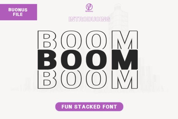
Boom: A Friendly Display Font That Lifts Your Digital Brand
Last week, I was finalizing the hero section of a new landing page for a mindfulness coaching practice — clean layout, soft imagery, intentional whitespace. But something felt off in the headline. The current sans serif felt safe, but not quite *present*. Not quite warm. So I reached for Boom: a display font that’s equal parts energetic and approachable — like a confident smile in type form.
Boom isn’t trying to be loud for the sake of it. It’s got subtle rounded terminals, open letterforms, and just enough personality to feel human — without sacrificing clarity. As a display font, it shines where you want attention: hero titles, section headers, call-to-action banners, course launch announcements, or even short brand taglines overlaid on image backgrounds. Its rhythm feels contemporary but never cold — perfect for creative portfolios, boutique online stores, or wellness brands building trust through warmth.
I dropped Boom into the hero heading first — “Breathe Deeper, Begin Now” — set at 48px on desktop, scaled down to 32px on tablet, and 28px on mobile. It held up beautifully. No awkward spacing collapses. No cramped counters on smaller screens. Because Boom is designed with digital legibility in mind, its x-height is generous, and its letter spacing stays balanced even when resized responsively. On light backgrounds? Crisp. Over muted gradients or soft-focus photography? Still readable — especially with a subtle text shadow or light background overlay for contrast.
That said, I wouldn’t use Boom for body copy. It’s not built for long paragraphs. And while it works well on dark mode (especially with a slight letter-spacing boost), I avoided pairing it with ultra-thin weights or overly busy textures behind it — readability always wins. For buttons, I kept it to short action phrases only (“Start Your Journey”, “Join the Circle”) and paired it with ample padding and generous tap targets. On mobile, anything under 24px started to lose its charm, so I reserved Boom strictly for headings and high-impact moments.
Font pairing was where Boom really settled into the design system. I paired it with Inter — a highly readable, neutral sans serif — for all body text, navigation, and captions. The contrast worked naturally: Boom brought voice and energy; Inter grounded everything with calm consistency. For a more editorial feel — say, on a blog redesign or digital magazine layout — I’ve also tested Boom with a gentle serif like IBM Plex Serif. The combination gave structure and sophistication without stiffness.
In practice, I’ve used Boom across several real projects: a product landing page for an eco-friendly stationery line (where its friendly tone matched hand-drawn illustrations), a portfolio site for a ceramic artist (its soft curves echoed the organic shapes in her work), and a course sales page for a freelance writing workshop (where “Write With Confidence” in Boom immediately signaled encouragement over authority). In each case, it helped shape tone before a single word was read.
Before deploying Boom on any live site, I double-checked three things: First, webfont availability — it’s offered in WOFF2 format, which loads fast and supports modern browsers. Second, included styles — Boom comes with one weight (Medium) and standard OpenType features, plus basic multilingual support covering Latin Extended-A characters. That covers most English, Spanish, French, and German content without fallback surprises. Third, licensing — it’s a commercial font, so I confirmed the license includes web embedding for client sites and SaaS platforms, not just desktop use. No last-minute licensing hiccups.
One thing I appreciate about Boom is how it avoids visual fatigue. Unlike some display fonts that shout with exaggerated swashes or tight kerning, Boom breathes. Its spacing feels considered, not forced. That makes it effective for repeated use — think section dividers, testimonial highlights, or even subtle logo lockups in SVG format. It doesn’t demand constant attention; it invites return visits.
Of course, context matters. On a finance dashboard or legal SaaS platform? Probably not the right fit. But for brands rooted in creativity, care, or community — yes. It signals openness. Approachability. Thoughtful design. And because it’s a display font, it reminds users they’re somewhere intentional — not just another generic template.
I also tested Boom in dark mode toggles and found it performed consistently — no color inversion issues, no rendering glitches in Chrome or Safari. On iOS, it rendered cleanly even with dynamic type scaling enabled. For accessibility, I made sure all Boom-powered headlines had sufficient contrast (at least 4.5:1 against their background) and remained semantic — wrapped in proper What surprised me most wasn’t how well Boom worked in big moments — that was expected — but how gracefully it handled subtlety. A single-line banner above a newsletter signup: “Your weekly dose of calm.” A small icon label beside a podcast episode title. Even as decorative accents in social media graphics exported from Figma — it retained its friendliness without pixelating or thinning out. If you’re choosing a display font to represent your digital brand, ask yourself: Does it reflect the feeling you want people to have *before* they scroll? Boom does that quietly, confidently, and without overcomplicating the layout. It doesn’t replace strong typography fundamentals — hierarchy, spacing, contrast — but it elevates them. It turns “just another headline” into a moment of connection. And that’s why, when the coaching site launched, the founder told me, “It feels like *me* — but clearer.” Not flashy. Not fussy. Just right.– tags, never 🔗 You Might Also Like