Like That: A Chunky Hand-Drawn Display Font for Digital Branding
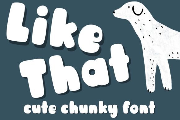
As a UI designer who ships landing pages, SaaS dashboards, and conversion-focused web experiences, I reach for display fonts like Like That when I need to signal warmth, approachability, and intentional personality—without sacrificing clarity or performance. It’s not just another handwritten font. Its chunky, hand-drawn strokes carry weight and charm while staying legible at scale—especially where digital users scan first and read second.
Like That is a display font built for impact: bold outlines, friendly imperfections, and generous spacing that breathes on screen. It avoids the fatigue of overly tight script fonts or the sterility of ultra-minimalist sans serifs. Instead, it lands somewhere between playful and polished—ideal for brands that want to feel human but still professional. Think boutique wellness apps, creative course platforms, indie online stores, or portfolio sites where tone matters as much as function.
Where Like That Earns Its Place in Web Layouts
This font thrives in high-visibility, low-density contexts—places where you’re guiding attention, not delivering paragraphs. Use it for:
- Hero section headlines—paired with a clean sans serif body font, Like That creates immediate visual hierarchy and emotional resonance before users scroll.
- CTA buttons and banners—its chunky shape holds up well at 24–36px even on mobile, especially against solid backgrounds or subtle image overlays.
- Section dividers and feature cards—a short phrase like “What You’ll Get” or “Meet Your Coach” gains memorability without competing with interface elements.
- Digital planner covers, blog headers, and course module titles—it adds consistent texture across branded digital assets without requiring custom illustrations.
It’s less effective—and not intended—for long-form text, navigation menus, form labels, or small mobile buttons under 20px. That’s not a limitation—it’s smart design discipline. Like That works best when it’s given space to be seen, not squeezed into functional roles better served by system or variable sans fonts.
Readability & Responsiveness: Practical Considerations
On light backgrounds, Like That delivers strong contrast and rhythm. On dark mode or deep color overlays, test its legibility at your smallest intended size—ideally no smaller than 28px on desktop and 24px on mobile. Its open counters and generous x-height help maintain recognition, but avoid thin stroke weights or low-contrast color combos (e.g., light gray on white).
For responsive layouts, define clear breakpoints: use Like That at 48px on desktop hero sections, scale down to 36px on tablet, and cap at 28px on mobile—not smaller. Never rely on CSS font-size: clamp() alone to preserve its character; test visually across devices. If your layout requires tight vertical rhythm, consider using it only above tablet breakpoint, falling back to a robust sans serif for mobile headers.
Font Pairing That Supports Clarity and Voice
The real power of Like That emerges in pairing. Its expressive nature demands contrast—not competition. For most web interfaces, pair it with a neutral, highly readable sans serif like Inter, Manrope, or IBM Plex Sans. These offer excellent hinting, wide language support, and predictable line heights—making them ideal for body copy, captions, and interface text.
For editorial or premium brand experiences (think newsletters, course sales pages, or brand kits), try pairing with a warm, low-contrast serif like Cormorant Garamond or Literata. The contrast between Like That’s handmade energy and a refined serif’s structure reinforces sophistication without stiffness.
Avoid pairing with other decorative fonts, condensed sans serifs, or scripts—those combinations dilute focus and muddy visual hierarchy. Let Like That be the voice; let the supporting typeface be the listener.
Licensing, Formats, and Real-World Deployment
Like That is a commercial font, and its licensing covers common digital uses: websites (via @font-face or CDN), client landing pages, SaaS UIs, online store banners, digital templates (Notion, Canva, Figma), and branded social graphics. Always verify the license includes web embedding—some versions restrict usage to desktop apps only.
Check what’s included: WOFF2 (for modern browsers), WOFF (for broader compatibility), and optionally OTF/TTF for design tools. Look for OpenType features like stylistic alternates or ligatures—if present, they add subtle polish to logo text or hero phrases. Multilingual support varies; confirm coverage for your audience’s languages (e.g., Latin Extended-A for European languages, basic Cyrillic if needed).
When loading Like That on a live site, use font-display: swap to avoid invisible text during load, and preload critical instances (e.g., hero headline) to prioritize perceived performance. Avoid loading multiple weights unless necessary—Like That shines as a single-weight display face, not a typographic system.
Branding Beyond the Browser
Because Like That carries such distinct tonal weight, it scales naturally across touchpoints: use it consistently in your Figma design system, Notion brand kit, Canva social templates, and email headers. That consistency builds recognition faster than any icon or color alone. A coaching brand using Like That in their course landing page, welcome email, and digital workbook cover signals cohesion—not randomness.
It also works well in constrained spaces where branding must land quickly: app store screenshots, Instagram story highlights, or PDF pitch decks. Unlike ultra-thin or overly ornate display fonts, Like That retains identity even at thumbnail size—because its chunkiness translates to visual weight, not blur.
If your goal is to make digital experiences feel intentional, human-centered, and unmistakably *yours*, Like That isn’t just decoration. It’s a deliberate tool for shaping how users feel before they click, scroll, or convert.