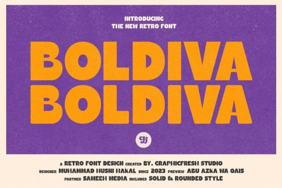
Boldiva: A Bold Display Font for Digital Brand Impact
As a UI designer who ships dozens of landing pages, SaaS dashboards, and e-commerce experiences each year, I reach for display fonts like Boldiva when I need instant visual authority—without sacrificing personality. It’s not just another retro-inspired typeface; it’s a deliberate tool for shaping how users perceive tone, trust, and intention in under two seconds.
Boldiva stands out through its confident geometry: thick, even strokes; tightly balanced curves; and angular terminals that feel both structured and playful. Unlike many retro fonts that lean into kitsch or nostalgia overload, Boldiva’s proportions are optimized for digital clarity—its x-height is generous, counters remain open at small sizes, and letter spacing stays legible even in tight hero layouts. That means it performs well not just as a logo lockup or banner headline, but as a functional part of your visual hierarchy.
Where Boldiva Earns Its Place in Real Web Layouts
In practice, Boldiva shines where attention must be claimed decisively. Think of it as your typographic anchor—not for body copy or navigation labels, but for the moments that define user intent:
- Hero section headlines on product landing pages—especially when paired with a clean sans serif (like Inter or Manrope) for subheads and CTAs;
- Section dividers in portfolio sites or creative agency websites, where bold typography replaces decorative icons;
- Call-to-action buttons on high-conversion sales pages—provided the font size stays ≥20px on desktop and ≥18px on mobile;
- Branded banners in Shopify stores or online course platforms, where short phrases (“New Launch”, “Limited Spots”, “Join Now”) benefit from Boldiva’s rhythmic weight and presence;
- Blog headers and social media graphics, where consistent use builds recognition across touchpoints without requiring custom illustration.
It works especially well for brands rooted in creativity—design studios, boutique fitness programs, indie publishing platforms, or coaching businesses that want to signal energy and authenticity without appearing unpolished.
Readability & Responsiveness: Practical Notes for Developers and Designers
Boldiva isn’t built for long paragraphs—and it shouldn’t be. Its strength lies in brevity and contrast. On mobile, keep usage to single-line headings only, with a minimum font size of 24px and generous line-height (1.2–1.3). Avoid stacking multiple Boldiva elements vertically; instead, let one strong title breathe alongside ample whitespace and supporting sans serif text.
For dark mode or image overlays, test contrast rigorously. Boldiva’s thick strokes hold up well against deep backgrounds—but avoid light gray or desaturated overlays unless you’ve tested luminance ratios (aim for ≥4.5:1 against background). On light backgrounds, consider subtle letter-spacing adjustments (+20–40 units) to prevent visual crowding in all-caps usage.
Smart Pairing for Cohesive Digital Identity
Display fonts live in conversation with their companions. With Boldiva, pairing is straightforward and effective:
- Sans serif body fonts (e.g., Inter, Poppins, or IBM Plex Sans) create crisp, modern contrast—ideal for SaaS apps, blogs, and conversion-focused pages;
- Neutral serif fonts (e.g., Literata or PT Serif) add editorial warmth for content-rich sites like newsletters, course libraries, or brand storytelling sections;
- Avoid pairing with other display or script fonts—Boldiva’s voice is distinct enough to carry the top layer alone.
That said, don’t default to “bold + regular” pairings without testing rhythm. Try setting Boldiva at 48px with Inter Regular at 18px and line-height 1.6—then adjust tracking and vertical spacing until the relationship feels intentional, not accidental.
Licensing, Formats, and Real-World Deployment
Boldiva is a premium font designed for commercial use—including websites, client projects, online stores, digital templates, and brand asset kits. When licensing, confirm it includes WOFF2 support (critical for fast loading), variable font options (if available), and multilingual character sets covering Latin Extended-A. Most reputable vendors include OpenType features like stylistic alternates and ligatures—use them sparingly for logo variations or hero treatments, not systemic UI text.
For performance-conscious teams: self-host the webfont files rather than relying on third-party CDNs, and preload critical display font assets in your . Always define fallback stacks (e.g., font-family: "Boldiva", -apple-system, BlinkMacSystemFont, "Segoe UI", sans-serif;) so layout integrity remains intact during load.
Why Boldiva Fits Into Thoughtful Digital Branding
In an era where users scroll past dozens of sites before pausing, typography is one of the few tools that communicates brand values before a single word is read. Boldiva doesn’t whisper—it declares. Yet its playfulness comes from proportion and curve, not ornamentation, making it feel human and intentional rather than gimmicky.
Used consistently across a website’s key touchpoints—hero, CTA, section headers, and branded graphics—it reinforces identity without repetition fatigue. And because it avoids overused retro tropes (think excessive shadow, exaggerated serifs, or distressed textures), it scales gracefully across devices, markets, and audience segments.
If your current display font feels safe—or worse, forgettable—Boldiva offers a calibrated alternative: bold enough to command attention, refined enough to earn trust, and versatile enough to become a quiet signature across your digital ecosystem.